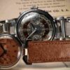
For vintage watch collectors, few topics are as important — or as challenging — as dial originality. The dial is the “face” of a watch, and its originality has a significant impact on value, desirability, and authenticity.
Among the many dial types found in mid-century timepieces, silvered dials are particularly delicate and often prone to oxidation, spotting, or discoloration, particularly as watch cases on little or no water resistance. These issues frequently led to refinishing or reprinting, sometimes decades ago, and sometimes more recently with modern techniques. Being able to distinguish an untouched original from a restored or reprinted dial is a skill worth developing.


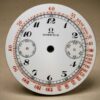
Here is an original and near-new dial: notice the quality of the printing, the letters and numbers with sharp “serifs” the even tone of the dial surface and how the whole dial looks untouched.
General Visual Telltales
The first step is to examine the dial as a whole, and to compare its overall condition with that of the case and hands.
A perfectly clean, bright dial in a case that shows decades of wear may raise suspicion : The key is coherence: dial, case, and hands should “tell the same story.” A dial that looks too new compared to the rest of the watch should be inspected carefully.


Symmetry and Layout
Look closely at the positioning of elements on the dial. Are the subdials — for instance, chronograph counters or a small seconds — perfectly centered within their recessed areas? Many poorly executed redials will have slight misalignments, with printing that looks off-center by fractions of a millimeter.
Vintage watch manufacturers used hand-etched steel clichés and precise presses to ensure symmetry. Even tiny errors in register are a clue that the dial might have been reprinted.
This is an old reprint, average quality, notice the low quality of the printing and how the counters are off- center. Also the azurage, the circular finish inside the chrono counters, has been flattened, a telltale of a refinished dial

Original dials from the mid-20th century were printed using hand-etched clichés — steel plates engraved by skilled artisans — which produced crisp, sharp, slightly raised printing. Under 10x magnification, the edges of the print lines appear well defined, with even ink deposition.

Modern reprints, in contrast, are usually created from laser-engraved plates or even digital pad- printing processes.
These often result in thinner, flatter print, sometimes with uneven ink spread or edges that look “soft.” Certain fonts, serifs, and numerals might be slightly different from the originals. Collectors should train their eye by comparing known originals to suspect dials.


Here is a modern redial, UG fonts are wrong, compur is low quality, overall print is below
standard. Additionally, this dial style has not ben seen in older and original UG chronographs
Counter Sinks
Notice the domed small seconds hand.
Another important telltale is the depth and profile of the subdial countersinks. Original chronograph and small-seconds dials were stamped against a perfectly flat counter-die, giving the recess a clean, domed profile and crisp edges.
notice the domed edge of this Longines reprinted dial, also the small second subdial print is off center


Reprinted dials are often printed on a generic counter-dial, leading to the counters being slightly domed on the subdial edge.
The result may be uneven, with mis-aligned tracks or numbers, like the UG dial on the left
Surface Texture and “Orange Peel”
The surface of an original silvered dial should be smooth and even, with any natural patina appearing as light spotting or gentle toning that sits visibly on top of the metal. This surface aging is part of the dial’s history and is often uniform.
Reprinted dials, on the other hand, frequently display an “orange peel” effect — a slightly granular or uneven appearance caused by corrosion or moisture damage before refinishing. In many cases, the refinishing process simply covers the underlying oxidation with new paint.


Under magnification, you can often see this granularity beneath what appears to be a perfectly repainted surface, revealing that the metal underneath was once tarnished.
This is a key distinction: on an original dial, oxidation is superficial and part of the visible texture, while on a reprinted dial it lies hidden below the newly applied layer, giving the surface an unnaturally uniform but slightly textured look. This dial is an easy tell as it has a very low quality print.
Another important clue is the quality of the ink itself. Under magnification, original dial printing from reputable manufactures — like Universal Genève, Longines, and Omega — is remarkably consistent. The paint was carefully applied through steel clichés, leaving well- defined, smooth, slightly raised letters or tracks with uniform thickness.
On a restored dial, like the Longines one on top, the ink may show tiny bubbles, pinholes, or irregular density, sometimes even appearing slightly fuzzy at the edges. These defects are clear signs of a reprint, as no such imperfections would have passed the quality control standards of major Swiss manufacturers in the 1940s–1960s.
Examining the Dial Back
On the right, an original dial with the manufacturer`s stamping, “Singer”.
Inspecting the reverse side of the dial can be helpful but is not always conclusive. Engraved numbers or letters on the back can be watchmaker service codes rather than conclusive evidence of refinishing.
Similarly, triangular or other geometric marks on the dial edge (usually on the cardinal points) may be factory-applied positioning guides and are not definite proof of restoration.


“Swiss Made” and Period-Correct Markings
Another common misconception is that the presence of “SWISS” or “SWISS MADE” below 6 o’clock proves originality. Restored dials often reproduce this text.
Instead, check that the markings are period correct — for example, a dial from the early 1950s should not read “T < 25,” which indicates tritium lume used after 1964.
Check that the fonts style, logo, and other inscriptions match archival examples from the correct production era.
Everything is off on this dial: poor and uneven print quality, wrong graphics, off-center counters, poor dial surface.


Other Expert Tips
• Magnification: Use a 10x loupe to inspect print edges, dial texture, and lume plots.
• Color Matching: Compare the tone of the dial to the hands and markers. Discrepancies (e.g., brand-new white dial with aged gold markers) can be a red flag.
• Archival References: Whenever possible, compare to catalog images, period advertisements, and known original examples.
• Experience: Building a mental library of original dials is crucial — visit museums, auction previews, and trusted dealers to train your eye.
Conclusion
Learning to distinguish an original dial from a restored one requires patience, practice, and a methodical approach. By checking the coherence of the watch, the symmetry and quality of printing, the geometry of subdials, the surface texture, and period-correct inscriptions, collectors can make more informed decisions.
A loupe and experience are your best allies — and when in doubt, seek expert advice before acquiring a piece where dial originality is crucial to its value.

Lorologiese.com – Chronoservice.ch Sagl © 2025 All Rights Reserved
Made With ♥ In Aldeia